

MAREA UX/UI App Design
A Purposefully Designed UX/UI Experience
A Brand that Flows with Intention and Ease. Explore Below.


Project Overview
Marea Coffee Application is a conceptual coffee app and lifestyle brand designed with a focus on clean UI, user-centered flows, and cohesive branding. This project showcases the full design process: from early wireframes and mood board creation to detailed visual system development, prototyping, and high-fidelity UI screens.
Designed in Figma and refined through multiple iterations, the app prioritizes intuitive navigation, clear hierarchy, and smooth interactions. The prototype demonstrates key user flows — from group ordering to rewards tracking — with all components working seamlessly across screens. — with all components working seamlessly across screens.
C R E A T I V E D I R E C T I O N B O A R D
A visual foundation that guided every design choice.


S I P . S U R F . R E P E A T

Strategic Brand
Positioning
Marea is more than just a coffee ordering app—it’s a lifestyle. Inspired by the rhythm of the tides and the effortless connection of surf culture, Marea was designed for those who seek balance, community, and simplicity. Whether you’re meeting friends at the beach or picking up a morning brew before catching the next wave, Marea makes ordering coffee feel as seamless as the ocean’s flow.
Built for adventurers, creatives, and coffee lovers, Marea enhances the experience of grabbing a cup of coffee—not just as a transaction, but as a shared moment.


Where inspiration meets intention — a foundation built on simplicity, balance, and surf culture.
Where inspiration meets intention — a foundation built on simplicity, balance, and surf culture.


Marea Cafe
Visual Identity
Marea’s design is rooted in calm, movement, and simplicity—a reflection of the ocean's natural energy. The color palette, featuring soft neutrals, deep blues, and crisp whites, evokes the tranquility of the sea while maintaining a modern, elevated aesthetic.
Typography plays a crucial role in Marea’s identity. Poppins, a geometric sans-serif, was chosen for its clean, approachable look. Its structured yet rounded form balances modern minimalism with warmth,
creating a seamless reading experience across the app. The logo and brand elements incorporate soft curves and fluid motion, reinforcing the effortless interaction Marea aims to provide.
The result is a timeless, sophisticated, and intuitive brand experience—one that feels as natural as the waves.


Marea’s Logo Identity
The primary Marea logo captures the brand’s organic, free-flowing spirit, reflecting relaxation, fluidity, and an authentic connection to surf culture. Its distinctive handwritten style is ideal for prominent placements, hero sections, website headers, and printed collateral where brand identity shines. Additionally, its expressive form makes it especially impactful on merchandise and packaging, such as coffee cups, tote bags, and apparel.
Marea’s main mark also works beautifully in storytelling-driven contexts, such as lifestyle photography and editorial layouts, reinforcing Marea’s premium, surf-inspired aesthetic.
The Icon Mark (Wave & Sun) serves as Marea’s secondary logo, offering a simplified and instantly recognizable representation of the brand. Designed specifically for compact usage, it maintains visual clarity across digital platforms such as social media profiles, app interfaces, icons, buttons, and favicons.
The Icon Mark minimalist aesthetic also makes it perfect for subtle branding applications, including watermarks and small-scale placements, ensuring brand consistency without compromising style or recognition.
The Story Behind
Marea's Colors
Marea’s color palette celebrates surf culture, inspired by ocean waves, sandy shores, and energizing coffee rituals. Vibrant blue evokes refreshing waves, while soft neutrals reflect serene sands. Rich browns represent the grounding strength of freshly brewed coffee—essential fuel for surfers at dawn patrol.

Typography: Crafted
for Clarity & Connection
Marea’s primary typeface, Poppins, is carefully chosen to embody both clarity and warmth, much like your favorite freshly brewed coffee. Its clean lines and balanced curves create a modern, inviting atmosphere, reminiscent of relaxing mornings spent seaside. This approachable yet refined typeface captures the essence of Marea—where coffee culture blends effortlessly with surf-inspired living.
Every word was crafted to reflect the brand’s light, fresh, and effortless energy.

Effortless Ordering,
Thoughtful Connection
Marea’s intuitive design streamlines group orders, fostering genuine connections within the surfing community. Its personalized features create a seamless ordering experience, bringing users together to share their passion—one cup, one conversation, one wave at a time.


Personalized Ordering,
Simplified
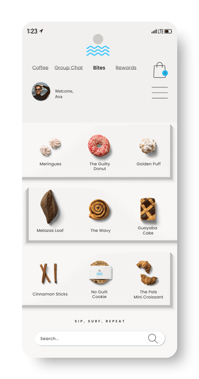
Marea's intuitive UX allows users to easily customize orders, manage personal tabs, and enjoy seamless checkout, making each interaction effortless and enjoyable.


Effortless Group Ordering, Designed for Connection
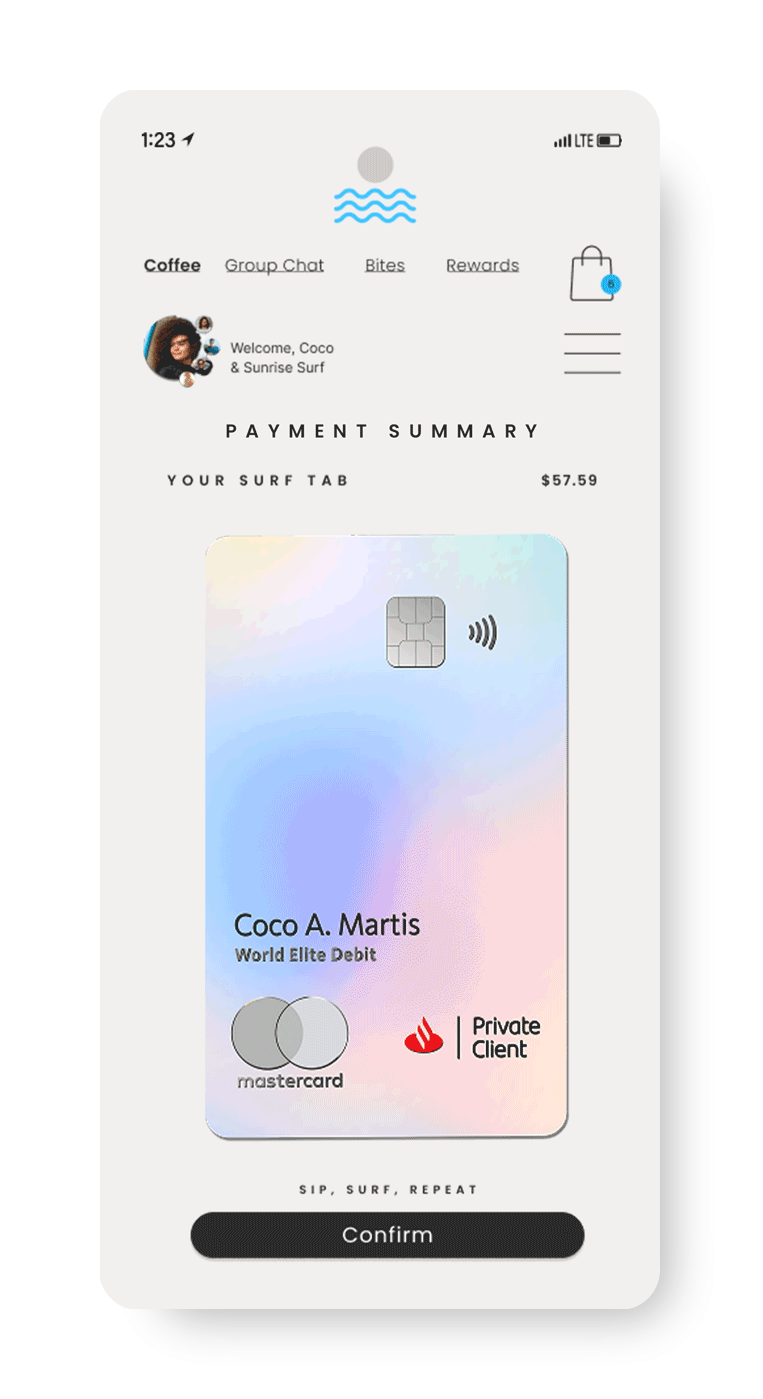
Marea is more than great coffee—it’s about connection. Its seamless group ordering lets friends, coworkers, and family easily place and manage shared orders in one place, eliminating the hassle of coordinating. Whether for an office coffee run or a beach meet-up, Marea ensures everyone gets their perfect order effortlessly.
With Marea, group ordering is effortless—members add their selections anytime, with real-time updates and a synced checkout. A built-in chat keeps coordination simple, while one tap finalizes the order. Marea takes care of the rest, ensuring everything is ready for pickup or delivery, just in time for the perfect surf-side moment.


Surf together. Sip together. Share the ride.
Surf together. Sip together. Share the ride.


Designed to Ebb,
Flow and Connect.
Marea’s brand presence adapts to every scene with ease — fresh, intentional, and community-driven.
An exploration of the Marea brand and its online presence — showcasing how it evolves and adapts across diverse platforms and touchpoints while staying true to its essence. From playful, surf-inspired messaging to clean, minimal product highlights, each story adapts to its own scene while staying connected to the brand’s soul: light, fresh, and rooted in community. The result is a cohesive, dynamic presence that feels intentional, effortless, and alive with the tide.
Bringing the Brand to Life in Stories.


Represent Marea
While Looking Great
The Marea apparel line combines casual comfort with thoughtful design, bringing our surf-inspired identity beyond the café. Crafted to be both stylish and wearable, each item effortlessly expresses the spirit of Marea—whether you're at the beach or on-the-go.
Rooted in natural tones and Caribbean-inspired hues, each visual element strengthens the story and transitions smoothly into the items.


Merch that extends the brand story — functional, stylish, and fresh.

